
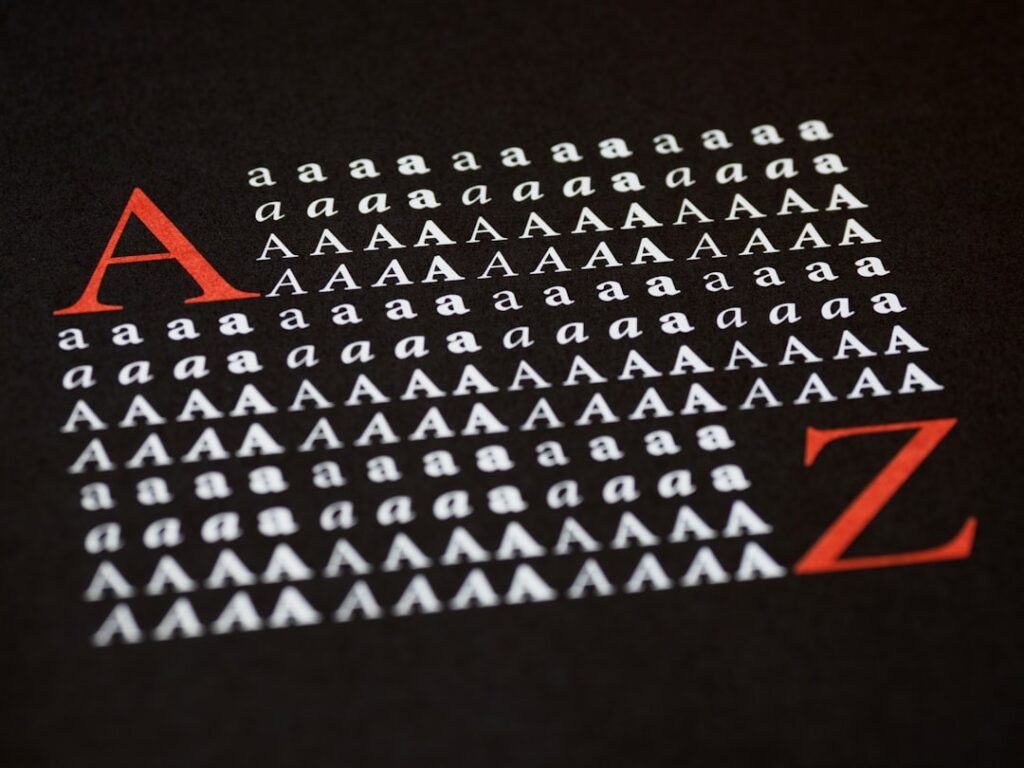
Selecting fonts that are difficult to read can significantly undermine the effectiveness of any written communication. Fonts that feature excessive embellishments, intricate serifs, or unconventional letterforms can create barriers for readers, making it challenging to absorb the intended message. For instance, while a font like “Papyrus” may evoke a sense of ancient history, its ornate style can lead to confusion, especially in longer texts.
The primary goal of typography is to enhance readability and ensure that the content is accessible to a wide audience. When fonts are chosen purely for aesthetic appeal without considering legibility, the result can be a frustrating experience for readers. Moreover, the context in which a font is used plays a crucial role in its effectiveness.
A whimsical font might be suitable for a children’s book cover but would likely be inappropriate for a legal document or a corporate report. The cognitive load increases when readers must decipher complex letterforms, which can lead to disengagement. Research has shown that fonts with simpler designs, such as Arial or Helvetica, tend to facilitate quicker reading and comprehension.
Therefore, it is essential to prioritize clarity over style when selecting fonts, ensuring that the message remains the focal point of the design.
Key Takeaways
- Choosing fonts that are hard to read can negatively impact the user experience and make it difficult for people to consume your content.
- Using too many different fonts can create a cluttered and unprofessional look, making it harder for readers to focus on the content.
- Ignoring font hierarchy can lead to confusion and make it difficult for readers to understand the importance of different pieces of information.
- Not considering brand personality when choosing fonts can result in a disconnect between the brand image and the visual representation.
- Overusing decorative fonts can make the text difficult to read and distract from the message you are trying to convey.
Using Too Many Different Fonts
The use of multiple fonts within a single design can create visual chaos and distract from the core message. While variety can add interest to a layout, an overabundance of different typefaces can lead to confusion and inconsistency. For example, a brochure that employs five different fonts may overwhelm the reader, making it difficult to discern which elements are most important.
A more effective approach is to limit the number of fonts to two or three that complement each other and create a cohesive visual identity. Additionally, using too many fonts can disrupt the flow of information. When readers encounter a mix of typefaces, their attention may be diverted from the content itself to the design choices being made.
This fragmentation can hinder comprehension and retention of information. Designers should strive for harmony in their typography by selecting fonts that share similar characteristics, such as weight or style. This not only enhances readability but also reinforces the overall aesthetic of the design, creating a more polished and professional appearance.
Ignoring Font Hierarchy

Font hierarchy is a critical aspect of typography that helps guide readers through content by establishing a clear visual structure. Ignoring this principle can lead to confusion and misinterpretation of information. For instance, if all text is presented in the same size and weight, readers may struggle to identify headings, subheadings, and body text.
A well-defined hierarchy allows readers to quickly scan and understand the organization of content, making it easier to locate key points. To effectively implement font hierarchy, designers should utilize variations in size, weight, and style to differentiate between various levels of information. For example, using a bold typeface for headings while employing a lighter weight for body text creates a clear distinction that aids navigation.
Additionally, incorporating different font sizes can emphasize important sections and guide readers through the material in a logical manner. By establishing a clear hierarchy, designers not only enhance readability but also improve the overall user experience.
Not Considering Brand Personality
| Metrics | Data |
|---|---|
| Customer Engagement | Low |
| Brand Loyalty | Decreasing |
| Customer Perception | Unfavorable |
| Competitive Advantage | Diminishing |
Typography is an essential component of brand identity, and failing to align font choices with brand personality can dilute messaging and confuse audiences. Each font carries its own connotations and emotional weight; for instance, a sleek sans-serif font may convey modernity and professionalism, while a playful script font might evoke creativity and whimsy. When brands neglect to consider how their font choices reflect their values and personality, they risk sending mixed signals to their audience.
For example, a financial institution aiming to project trustworthiness and stability would benefit from using traditional serif fonts like Times New Roman or Georgia. In contrast, a tech startup focused on innovation might opt for contemporary sans-serif fonts like Futura or Roboto. By carefully selecting fonts that resonate with their target audience and reflect their brand ethos, companies can create a more cohesive and impactful visual identity that fosters recognition and loyalty.
Overusing Decorative Fonts
Decorative fonts can add flair and personality to designs; however, overusing them can lead to cluttered visuals and diminished readability. These fonts are often best reserved for specific applications, such as headlines or promotional materials, rather than being used throughout an entire piece of content. For instance, while a decorative font may work well for a wedding invitation, it could become overwhelming if used for body text in an article or report.
The key is moderation; decorative fonts should enhance rather than dominate the design. When used sparingly, they can draw attention to important elements without compromising legibility. Designers should consider pairing decorative fonts with simpler typefaces that provide contrast and balance.
This approach allows for creative expression while maintaining clarity and coherence in the overall design.
Ignoring Accessibility Guidelines

Accessibility in typography is often overlooked but is crucial for ensuring that all individuals can engage with content effectively. Ignoring accessibility guidelines can alienate users with visual impairments or reading difficulties. For example, using low-contrast color combinations between text and background can make it challenging for individuals with vision impairments to read content comfortably.
Similarly, overly small font sizes can pose significant barriers for those with limited eyesight. To create accessible designs, it is essential to adhere to established guidelines such as the Web Content Accessibility Guidelines (WCAG). These guidelines recommend using high-contrast color schemes, maintaining minimum font sizes (typically 16 pixels for body text), and ensuring that line spacing is adequate for readability.
By prioritizing accessibility in typography, designers not only comply with legal standards but also foster inclusivity and enhance user experience for all audiences.
Using Fonts that Don’t Scale Well
In an increasingly digital world where content is consumed across various devices and screen sizes, choosing fonts that do not scale well can lead to significant issues in readability and aesthetics. Fonts that appear crisp and clear on desktop screens may become distorted or illegible on mobile devices if they are not designed with scalability in mind. For instance, intricate serif fonts may lose their defining features when scaled down, resulting in a muddled appearance that detracts from the overall message.
To mitigate these challenges, designers should opt for responsive typography that maintains clarity across different platforms. This involves selecting fonts that are specifically designed for versatility and legibility at various sizes. Additionally, employing relative units like “em” or “rem” instead of fixed pixel sizes allows text to adapt fluidly to different screen resolutions.
By prioritizing scalability in font selection, designers ensure that their content remains accessible and visually appealing across all devices.
Not Paying Attention to Line Spacing
Line spacing, or leading, is an often-overlooked aspect of typography that plays a vital role in readability. Insufficient line spacing can cause text to appear cramped and overwhelming, making it difficult for readers to follow along smoothly. Conversely, excessive line spacing can disrupt the flow of text and create disjointed reading experiences.
Striking the right balance is essential for facilitating comfortable reading. Research suggests that optimal line spacing typically falls between 1.2 to 1.5 times the font size; this range allows for adequate breathing room between lines while maintaining cohesion within paragraphs. For example, if using a 12-point font size, line spacing should ideally be set between 14.4 points (1.2) and 18 points (1.5).
By paying careful attention to line spacing, designers can enhance legibility and create visually appealing layouts that invite readers to engage with the content.
Using Fonts that are Overused
In the realm of design, certain fonts become ubiquitous due to their popularity and ease of access; however, relying on overused fonts can lead to uninspired designs that lack originality. Fonts like “Comic Sans” or “Arial” have become synonymous with mediocrity due to their widespread use in various contexts. When designers default to these familiar typefaces without considering alternatives, they risk creating work that fails to stand out in a crowded marketplace.
To cultivate unique designs, it is essential to explore lesser-known typefaces that align with the project’s goals while still maintaining readability. Resources such as Google Fonts or Adobe Fonts offer extensive libraries of diverse typefaces that can elevate design projects beyond conventional choices. By embracing originality in font selection, designers can create distinctive visual identities that resonate with audiences and leave lasting impressions.
Ignoring Cross-Platform Compatibility
In today’s multi-device landscape, ensuring cross-platform compatibility in typography is paramount for delivering consistent user experiences across various environments. Fonts that render well on one platform may not perform similarly on another due to differences in rendering engines or operating systems. Ignoring this aspect can lead to discrepancies in appearance that confuse users and detract from brand integrity.
To address cross-platform compatibility issues, designers should utilize web-safe fonts or embed custom fonts using services like Google Fonts or Adobe Typekit. These platforms provide reliable solutions for ensuring consistent rendering across different browsers and devices. Additionally, testing designs on multiple platforms before finalizing them helps identify potential issues early on, allowing designers to make necessary adjustments for optimal performance.
Not Testing Fonts on Different Devices
The final step in effective typography involves rigorous testing across various devices and screen sizes before launching any design project. Failing to conduct thorough testing can result in unforeseen issues related to legibility or aesthetics that may only become apparent once users interact with the content on their devices. For instance, a beautifully designed website may look stunning on a desktop but could present significant readability challenges on mobile devices if not properly optimized.
Testing should encompass various scenarios—different browsers, operating systems, and screen resolutions—to ensure that typography remains consistent and effective across all platforms. This process allows designers to identify any discrepancies in font rendering or layout issues early on so they can be addressed before reaching the end user. By prioritizing testing as an integral part of the design process, creators can deliver polished typography that enhances user experience and engagement across all devices.
When considering the top 10 mistakes in choosing fonts for websites and branding, it’s essential to also understand the broader context of effective design strategies. A related article that delves into the foundational aspects of creating a successful online presence is The Art and Science of Website Design: A Pillar of Digital Success. This piece explores the critical elements of website design, emphasizing the importance of cohesive visual elements, including typography, to enhance user experience and brand identity. By integrating insights from both articles, designers can make more informed decisions that align with their branding goals and audience expectations.
FAQs
What are the common mistakes in choosing fonts for websites and branding?
Some common mistakes in choosing fonts for websites and branding include using too many different fonts, using illegible or hard-to-read fonts, and not considering the brand’s personality and target audience when choosing fonts.
Why is it important to choose the right fonts for websites and branding?
Choosing the right fonts for websites and branding is important because it can affect the readability, user experience, and overall perception of the brand. Fonts play a crucial role in conveying the brand’s personality and message to the audience.
How can using too many different fonts be a mistake in branding?
Using too many different fonts in branding can create a cluttered and unprofessional look. It can also dilute the brand’s identity and make it difficult for the audience to associate a specific font with the brand.
What are some examples of illegible or hard-to-read fonts that should be avoided?
Examples of illegible or hard-to-read fonts that should be avoided include overly decorative or ornate fonts, extremely thin or condensed fonts, and fonts with poor spacing or letterforms that are difficult to distinguish.
How can not considering the brand’s personality and target audience be a mistake in choosing fonts?
Not considering the brand’s personality and target audience when choosing fonts can result in a mismatch between the visual identity and the intended message. Different fonts convey different emotions and associations, so it’s important to choose fonts that align with the brand’s values and resonate with the target audience.
What role do fonts play in creating a cohesive brand identity?
Fonts play a crucial role in creating a cohesive brand identity by reinforcing the brand’s personality, values, and visual language. Consistent use of fonts across different brand materials helps to establish a strong and recognizable brand identity.
How can not considering the legibility of fonts impact a website’s user experience?
Not considering the legibility of fonts can impact a website’s user experience by making it difficult for visitors to read and comprehend the content. This can lead to frustration, decreased engagement, and ultimately, a negative impression of the brand.
What are some best practices for choosing fonts for websites and branding?
Some best practices for choosing fonts for websites and branding include selecting a limited number of complementary fonts, ensuring legibility across different devices and screen sizes, and conducting thorough testing to gauge the fonts’ impact on user experience.
How can typography influence the perception of a brand?
Typography can influence the perception of a brand by conveying its personality, values, and tone of voice. The right choice of typography can help to establish a strong and positive association with the brand, while the wrong choice can lead to confusion and misalignment with the brand’s intended image.
What are the potential consequences of making mistakes in choosing fonts for websites and branding?
The potential consequences of making mistakes in choosing fonts for websites and branding include a lack of brand consistency, diminished readability and user experience, and a weakened brand identity. These mistakes can ultimately impact the brand’s credibility and ability to connect with its target audience.