A well-designed logo serves as the cornerstone of a brand’s identity, encapsulating its essence in a single visual representation. The importance of balance in logo design cannot be overstated, as it directly influences how a brand is perceived by its audience. A balanced logo conveys professionalism, reliability, and trustworthiness, which are essential attributes for any business aiming to establish a strong market presence.
When a logo is visually balanced, it creates a sense of stability and harmony, making it more memorable and effective in communicating the brand’s message. Moreover, a balanced logo can enhance brand recognition and recall. Consumers are more likely to remember a logo that is aesthetically pleasing and well-proportioned.
This is particularly crucial in today’s competitive marketplace, where brands vie for attention in a crowded visual landscape. A logo that achieves balance not only stands out but also resonates with the target audience on an emotional level. This connection can foster loyalty and encourage consumers to choose one brand over another, making balanced logo design an essential component of successful branding strategies.
Key Takeaways
- A balanced logo design is crucial for creating a visually appealing and memorable brand identity.
- Understanding the principles of balance in design, such as symmetrical and asymmetrical balance, is essential for creating a harmonious logo.
- Choosing the right color palette is important for achieving balance and evoking the desired emotions in a logo design.
- Utilizing negative space effectively can help create a balanced and impactful logo design.
- Creating harmony through symmetry and asymmetry can add visual interest and balance to a logo design.
Understanding the principles of balance in design
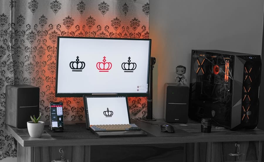
Balance in design refers to the distribution of visual weight within a composition. It can be categorized into two primary types: symmetrical and asymmetrical balance. Symmetrical balance occurs when elements are arranged evenly around a central axis, creating a mirror-like effect.
This type of balance often evokes feelings of order and stability, making it suitable for brands that wish to project reliability and tradition. For instance, many financial institutions utilize symmetrical logos to instill confidence in their clients. On the other hand, asymmetrical balance involves the arrangement of elements in a way that achieves equilibrium without mirroring each side.
This approach can create a more dynamic and modern feel, appealing to brands that want to convey innovation and creativity. Asymmetrical designs often rely on contrasting elements—such as size, color, and shape—to achieve balance. Understanding these principles allows designers to make informed choices about how to structure their logos, ensuring that they effectively communicate the desired brand message while maintaining visual appeal.
Choosing the right color palette for a balanced logo

Color plays a pivotal role in logo design, influencing perceptions and evoking emotions. When selecting a color palette for a balanced logo, designers must consider not only the psychological impact of colors but also how they interact with one another. A harmonious color scheme can enhance the overall balance of a logo, while clashing colors can create visual discord.
For example, blue is often associated with trust and professionalism, making it a popular choice for corporate logos, while vibrant colors like orange and yellow can convey energy and enthusiasm. In addition to psychological implications, designers should also consider color contrast and saturation when creating a balanced logo. High contrast between colors can draw attention to specific elements, while low contrast can create a more subdued and sophisticated look.
A well-balanced color palette should include a mix of primary and secondary colors that complement each other without overwhelming the viewer. By carefully selecting colors that work together harmoniously, designers can create logos that are not only visually appealing but also effectively communicate the brand’s identity.
Utilizing negative space effectively
| Technique | Description |
|---|---|
| Whitespace | Using empty space to create a sense of balance and harmony in the design. |
| Typography | Allowing text to breathe by using ample spacing between lines and letters. |
| Visual Hierarchy | Using negative space to guide the viewer’s eye to the most important elements of the design. |
| Composition | Arranging elements with enough negative space to create a clear and uncluttered layout. |
Negative space—the area surrounding and between the main elements of a design—can be a powerful tool in logo design. When used effectively, negative space can enhance the overall balance of a logo while adding depth and intrigue. It allows designers to create shapes or symbols that may not be immediately apparent, encouraging viewers to engage with the design on a deeper level.
For instance, the FedEx logo cleverly utilizes negative space to form an arrow between the letters “E” and “x,” symbolizing speed and precision. Incorporating negative space into a balanced logo requires careful consideration of composition and placement. Designers must ensure that the negative space complements the positive elements without detracting from them.
This balance can create a sense of unity within the design, making it more cohesive and memorable. Additionally, effective use of negative space can help simplify complex ideas or concepts, allowing the logo to communicate its message clearly and succinctly.
Creating harmony through symmetry and asymmetry
Symmetry and asymmetry are two fundamental approaches to achieving harmony in logo design. Symmetrical logos often evoke feelings of stability and order, making them suitable for brands that wish to convey reliability and tradition. For example, many luxury brands utilize symmetrical designs to project an image of elegance and sophistication.
The classic Mercedes-Benz logo exemplifies this principle with its perfectly balanced three-pointed star enclosed within a circle. Conversely, asymmetrical logos can create a sense of movement and energy, appealing to brands that want to convey innovation or creativity. Asymmetry allows for more freedom in design, enabling designers to experiment with different shapes and arrangements while still achieving balance through careful consideration of visual weight.
The Nike swoosh is an excellent example of an asymmetrical logo that successfully communicates dynamism and athleticism while maintaining visual equilibrium. By understanding how to leverage both symmetry and asymmetry, designers can create logos that resonate with their target audience while effectively representing the brand’s values.
Selecting the right typography for a balanced logo

The Power of Font Choice
The choice of font can significantly impact how a brand is perceived, making it essential for creating a balanced logo. Designers must consider factors such as font weight, style, and spacing when incorporating typography into their designs. A heavy font may convey strength and stability, while a lighter font may evoke elegance and sophistication.
Kerning: The Key to Cohesive Typography
In addition to font selection, kerning—the spacing between individual letters—plays a vital role in achieving balance within typography. Proper kerning ensures that letters are evenly spaced, creating a cohesive look that enhances readability.
Typography in Harmony with Other Elements
Designers should also consider how typography interacts with other elements in the logo. For instance, pairing a bold typeface with delicate graphic elements can create visual tension that adds interest while maintaining overall balance. By thoughtfully selecting typography that complements the other components of the logo, designers can create a harmonious design that effectively communicates the brand’s identity.
Ensuring scalability and versatility in logo design
A well-balanced logo must be scalable and versatile to maintain its effectiveness across various applications and sizes. Logos are often used in diverse contexts—from business cards to billboards—so they must retain their clarity and impact regardless of scale. Designers should consider how different elements within the logo will appear when resized; intricate details may become lost at smaller sizes, while overly simplistic designs may lack impact when enlarged.
To ensure scalability, designers should create logos using vector graphics rather than raster images. Vector graphics allow for infinite scaling without loss of quality, making them ideal for logos that need to be reproduced across various mediums. Additionally, designers should test their logos in different formats—such as monochrome or grayscale—to ensure versatility across different backgrounds and applications.
A balanced logo should be adaptable enough to maintain its integrity whether displayed on digital platforms or printed materials.
Incorporating meaningful symbolism in a balanced logo
Symbolism plays an essential role in logo design by conveying deeper meanings associated with the brand’s identity or values. A well-balanced logo often incorporates symbols that resonate with the target audience while maintaining visual harmony within the design. For instance, the Apple logo symbolizes innovation and simplicity through its minimalist design—a reflection of the company’s ethos.
When incorporating symbolism into a balanced logo, designers must ensure that the symbols align with the brand’s message and values. This requires thorough research into cultural connotations and associations related to specific symbols or imagery. Additionally, designers should strive for simplicity; overly complex symbols can detract from the overall balance of the logo and confuse viewers.
By thoughtfully integrating meaningful symbolism into their designs, designers can create logos that not only look visually appealing but also communicate powerful messages about the brand.
Avoiding clutter and maintaining simplicity in logo design
Simplicity is a hallmark of effective logo design; cluttered logos can overwhelm viewers and dilute the brand’s message. A balanced logo should prioritize clarity and focus on essential elements that convey the brand’s identity without unnecessary embellishments. This principle is evident in iconic logos such as Nike’s swoosh or McDonald’s golden arches—both designs are instantly recognizable due to their simplicity.
To achieve simplicity in logo design, designers should adopt a minimalist approach by stripping away extraneous details that do not contribute to the overall message or aesthetic. This process often involves iterative refinement—designers may create multiple versions of a logo before arriving at the final design that strikes the right balance between simplicity and effectiveness. By maintaining simplicity in their designs, designers can create logos that are not only visually appealing but also easily memorable for consumers.
Testing and refining the balanced logo design
The process of creating a balanced logo does not end with its initial design; testing and refining are crucial steps in ensuring its effectiveness. Designers should seek feedback from various stakeholders—including clients, target audiences, and fellow designers—to gain insights into how well the logo communicates its intended message. This feedback can highlight areas for improvement or adjustments needed to achieve better balance within the design.
Prototyping is another valuable tool during this phase; designers can create mock-ups of how the logo will appear across different applications—such as websites, merchandise, or signage—to assess its versatility and scalability in real-world contexts. Iterative testing allows designers to make informed decisions about adjustments needed to enhance balance while ensuring that the final product aligns with the brand’s identity and goals.
Implementing balanced logo design in branding and marketing strategies
Once a balanced logo has been finalized, it becomes an integral part of broader branding and marketing strategies. The logo serves as a visual anchor for all brand communications—appearing on everything from business cards to social media profiles—and must consistently reflect the brand’s identity across all platforms. Effective implementation involves creating comprehensive brand guidelines that outline how the logo should be used in various contexts, including color variations, sizing requirements, and placement rules.
Additionally, marketing strategies should leverage the power of the balanced logo to build brand recognition and loyalty among consumers. Consistent use of the logo across advertising campaigns helps reinforce brand identity while fostering familiarity among target audiences. By integrating their balanced logo into all aspects of branding and marketing efforts, businesses can create cohesive narratives that resonate with consumers—ultimately driving engagement and loyalty over time.
When it comes to logo design, finding the perfect balance between creativity and clarity is crucial. According to a recent article on AboveRoots, incorporating these 10 best practices can help achieve a successful logo design that effectively communicates a brand’s message. Additionally, it’s important to consider the hidden costs of cheap hosting providers, as discussed in another informative article on AboveRoots. To ensure a cohesive brand image, it’s also recommended to find a website designer near you, as highlighted in a helpful guide on AboveRoots.
FAQs
What is logo design?
Logo design is the process of creating a visual representation of a brand or company through the use of symbols, images, and typography. A well-designed logo is essential for creating a strong brand identity and making a memorable impression on customers.
Why is it important to balance creativity and clarity in logo design?
Balancing creativity and clarity in logo design is important because a logo needs to be both visually appealing and easily recognizable. A creative logo can help a brand stand out, while clarity ensures that the logo is easily understood and remembered by consumers.
What are some best practices for balancing creativity and clarity in logo design?
Some best practices for balancing creativity and clarity in logo design include: keeping the design simple, using appropriate colors and typography, ensuring scalability, considering the target audience, and testing the logo in different contexts.
How can simplicity contribute to a clear and creative logo design?
Simplicity in logo design helps to ensure that the logo is easily recognizable and memorable. A simple design is also more versatile and can be used across various platforms and applications without losing its impact.
What role do colors and typography play in balancing creativity and clarity in logo design?
Colors and typography play a crucial role in logo design as they can convey the brand’s personality and message. It’s important to choose colors and typography that are both visually appealing and legible, while also aligning with the brand’s identity.
Why is scalability important in logo design?
Scalability is important in logo design because a logo needs to look good and be legible across different sizes and formats, from small business cards to large billboards. A scalable logo ensures that the brand’s identity remains consistent and recognizable in any context.
How does considering the target audience contribute to a successful logo design?
Considering the target audience helps in creating a logo that resonates with the intended consumers. Understanding the preferences and expectations of the target audience can guide the design choices and ensure that the logo effectively communicates the brand’s message.
Why is it important to test a logo design in different contexts?
Testing a logo design in different contexts helps to ensure that it remains effective and legible across various applications, such as print, digital, and merchandise. It also allows for any necessary adjustments to be made before finalizing the design.
What are some common mistakes to avoid in logo design?
Common mistakes to avoid in logo design include using overly complex designs, relying on trends that may quickly become outdated, using inappropriate colors or typography, and neglecting to consider the scalability and versatility of the logo.
How can a well-balanced logo design contribute to a brand’s success?
A well-balanced logo design can contribute to a brand’s success by creating a strong and memorable visual identity that resonates with consumers. A clear and creative logo can help to differentiate a brand from its competitors and leave a lasting impression on customers.


