
To create a successful logo, it is imperative to have a deep understanding of the brand it represents. This involves delving into the brand’s mission, values, and target audience. A logo is not merely a visual symbol; it encapsulates the essence of the brand and communicates its identity to the world.
For instance, a tech startup focused on innovation and cutting-edge solutions would benefit from a logo that conveys modernity and forward-thinking. In contrast, a family-owned bakery might opt for a design that evokes warmth and nostalgia, reflecting its commitment to tradition and quality. Moreover, understanding the brand also means recognizing its unique selling propositions (USPs) and how they differentiate it from competitors.
This knowledge allows designers to create logos that not only resonate with the intended audience but also stand out in a crowded marketplace. For example, if a brand prides itself on sustainability, incorporating elements that symbolize nature or eco-friendliness can reinforce this message. By aligning the logo with the brand’s core values, designers can ensure that it serves as an authentic representation of what the brand stands for.
Key Takeaways
- Understand the brand: Before designing a logo, understand the brand’s values, mission, and target audience.
- Keep it simple: A simple and clean design is more memorable and versatile.
- Choose a versatile color palette: Select colors that work well in different contexts and convey the brand’s personality.
- Use clean and readable fonts: Opt for fonts that are easy to read and complement the brand’s image.
- Consider scalability: Ensure the logo looks good and is recognizable at different sizes.
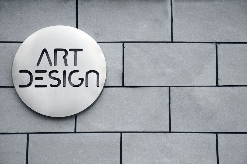
Keep it simple
Simplicity is a cornerstone of effective logo design. A simple logo is easily recognizable and memorable, making it more likely to leave a lasting impression on consumers. When a logo is cluttered with excessive details or intricate designs, it can become confusing and difficult to reproduce across various mediums.
For instance, consider the iconic Nike swoosh. Its simplicity allows for instant recognition, whether it appears on a billboard or a small product tag. The swoosh conveys movement and speed without overwhelming viewers with complexity.
Additionally, simplicity aids in versatility. A straightforward design can be adapted for different applications, from business cards to large-scale signage, without losing its impact. This adaptability is crucial in today’s multi-channel marketing landscape, where logos must perform well across digital platforms, print media, and merchandise.
By focusing on essential elements and avoiding unnecessary embellishments, designers can create logos that maintain their integrity and effectiveness in various contexts.
Choose a versatile color palette

Color plays a pivotal role in logo design, influencing perceptions and evoking emotions. A well-chosen color palette can enhance brand recognition and convey specific messages about the brand’s personality. For example, blue often signifies trust and reliability, making it a popular choice for financial institutions like banks and insurance companies.
In contrast, vibrant colors like red or orange can evoke feelings of excitement and energy, which may be more suitable for brands in the entertainment or food industries. When selecting colors for a logo, versatility is key. A limited color palette allows for easier reproduction across different mediums while maintaining visual coherence.
Designers should consider how the colors will appear in various contexts—on screens, in print, or even embroidered on merchandise. Additionally, it’s essential to think about how the colors will resonate with the target audience. Conducting research on color psychology can provide valuable insights into how different hues may be perceived by different demographics, ensuring that the chosen palette aligns with the brand’s identity and goals.
Use clean and readable fonts
Typography is another critical element of logo design that can significantly impact its effectiveness. The choice of font should reflect the brand’s personality while ensuring clarity and readability. A logo featuring an overly ornate or complex typeface may look appealing at first glance but can become illegible when scaled down or viewed from a distance.
For instance, brands like Coca-Cola have successfully utilized distinctive yet readable fonts that are instantly recognizable, even when viewed quickly. In addition to legibility, the font should harmonize with other design elements in the logo. A clean sans-serif font may convey modernity and professionalism, while a handwritten script might evoke warmth and approachability.
Designers must strike a balance between creativity and functionality; the font should enhance the overall design rather than detract from it. Furthermore, considering how the font will perform across various applications—such as digital platforms or print materials—ensures that it remains effective in all contexts.
Consider scalability
Scalability is an essential consideration in logo design, as logos must maintain their integrity and visual appeal across various sizes and formats. A logo that looks stunning on a website may lose its impact when reduced to fit on a business card or enlarged for a billboard. Therefore, designers should create logos with scalability in mind from the outset.
This often involves simplifying intricate details that may become lost when scaled down. One effective approach to ensure scalability is to design logos using vector graphics software. Vector graphics allow for infinite resizing without loss of quality, making them ideal for logos that need to be used in diverse applications.
Additionally, testing the logo at different sizes during the design process can help identify potential issues with legibility or visual balance. By prioritizing scalability, designers can create logos that remain effective and recognizable regardless of their size or medium.
Ensure it works in black and white

While color is an important aspect of logo design, it is equally crucial to ensure that the logo remains effective in black and white. Many applications may require logos to be reproduced without color—such as newspaper ads, faxes, or promotional items like pens and mugs—so a well-designed logo should retain its impact even in monochrome formats. This means considering contrast, shapes, and overall composition when designing the logo.
A strong black-and-white logo often relies on bold shapes and clear lines to convey its message effectively without color cues. For example, the Apple logo is instantly recognizable even when rendered in black and white due to its simple yet striking silhouette. Designers should test their logos in grayscale during the design process to ensure they maintain clarity and visual appeal without color distractions.
By prioritizing black-and-white adaptability, designers can create logos that are versatile and functional across various contexts.
Avoid trends
In the fast-paced world of design, trends come and go with remarkable speed. While it may be tempting to incorporate current design fads into a logo, doing so can jeopardize its longevity and relevance. A logo designed around a fleeting trend may quickly become outdated, necessitating costly redesigns sooner than anticipated.
Instead of chasing trends, designers should focus on creating timeless logos that embody the brand’s essence and values. To achieve this timelessness, designers can draw inspiration from classic design principles rather than contemporary trends. For instance, logos that utilize geometric shapes or minimalist designs often stand the test of time due to their simplicity and clarity.
Brands like Nike or McDonald’s have successfully maintained their logos for decades by adhering to fundamental design principles while avoiding trendy elements that could date their branding. By prioritizing longevity over trendiness, designers can create logos that remain relevant and effective for years to come.
Make it memorable
A memorable logo is one that sticks in the minds of consumers long after they’ve seen it. To achieve this memorability, designers must focus on creating unique elements that distinguish the logo from competitors while also resonating with the target audience. This could involve incorporating symbolic imagery or clever visual puns that relate to the brand’s identity or mission.
For example, the FedEx logo cleverly uses negative space to create an arrow between the letters “E” and “x,” symbolizing speed and precision. Additionally, repetition plays a significant role in making logos memorable. Consistent use of a well-designed logo across all marketing materials reinforces brand recognition over time.
When consumers encounter a logo repeatedly in various contexts—whether through advertisements, social media posts, or product packaging—they are more likely to remember it. Therefore, designers should aim for distinctiveness while ensuring that the logo remains consistent across all platforms to maximize its memorability.
Test for adaptability
Adaptability is crucial for modern logos as they must function across various platforms and mediums—from digital screens to print materials to merchandise. A successful logo should be able to adapt seamlessly to different contexts without losing its identity or effectiveness. This requires thorough testing during the design process to evaluate how well the logo performs in diverse applications.
Designers can conduct mock-ups of how the logo will appear on different surfaces—such as business cards, websites, social media profiles, or promotional items—to assess its adaptability visually. Additionally, considering how the logo will look in different orientations (horizontal vs. vertical) or formats (square vs.
rectangular) can help identify potential issues early on. By rigorously testing adaptability throughout the design process, designers can ensure that their logos remain effective regardless of where they are displayed.
Seek feedback
Feedback is an invaluable component of the logo design process. Engaging stakeholders—such as clients, team members, or even potential customers—can provide fresh perspectives on how well a logo communicates its intended message and resonates with its audience. Gathering feedback at various stages of development allows designers to refine their concepts based on constructive criticism before finalizing their designs.
When seeking feedback, it’s essential to ask specific questions about what aspects of the logo work well and what could be improved. This targeted approach encourages more meaningful responses rather than vague opinions about personal preferences. Additionally, presenting multiple variations of a logo can help gauge which elements resonate most with viewers while providing insights into potential adjustments needed for optimal effectiveness.
Aim for longevity
Ultimately, one of the primary goals of any logo design should be longevity. A well-crafted logo has the potential to represent a brand for years—if not decades—without requiring significant changes or redesigns. To achieve this longevity, designers must focus on creating logos that are not only visually appealing but also deeply connected to the brand’s core values and mission.
This requires careful consideration of all elements involved in the design process—from color choices to typography to overall composition—to ensure they align with what the brand stands for over time. Additionally, staying true to timeless design principles rather than chasing fleeting trends will help ensure that the logo remains relevant as market dynamics evolve. By prioritizing longevity in their designs, creators can develop logos that serve as enduring symbols of their brands’ identities for years to come.
When it comes to creating a timeless logo design, it is important to consider the overall branding strategy of a company. In a related article on branding mistakes that can kill credibility, Top 10 Branding Mistakes That Kill Credibility, the importance of consistency and professionalism in branding is highlighted. This article emphasizes the need for a cohesive brand identity across all platforms, including logo design. By avoiding common branding mistakes, companies can ensure that their logo design remains relevant and impactful for years to come.
FAQs
What is timeless logo design?
Timeless logo design refers to creating a logo that remains relevant and effective for a long period of time, without needing frequent updates or redesigns. Timeless logos are able to withstand changing design trends and continue to represent a brand effectively.
Why is timeless logo design important?
Timeless logo design is important because it helps a brand maintain a consistent and recognizable identity over time. A timeless logo can also save a brand money by reducing the need for frequent redesigns and updates.
What are the key elements of timeless logo design?
Key elements of timeless logo design include simplicity, versatility, relevance to the brand, and a strong concept. Timeless logos often feature clean lines, balanced proportions, and a design that can be easily scaled to different sizes and applied across various mediums.
How can color choice impact timeless logo design?
Color choice can impact timeless logo design by influencing the logo’s ability to remain relevant and appealing over time. Neutral colors and classic color combinations are often used in timeless logos to ensure they do not become dated.
What role does typography play in timeless logo design?
Typography plays a crucial role in timeless logo design, as the choice of font can greatly impact the logo’s longevity. Timeless logos often feature simple, clean, and easily readable typography that can withstand changing design trends.
How does research contribute to timeless logo design?
Research contributes to timeless logo design by helping designers understand the brand, its target audience, and its industry. This understanding allows designers to create a logo that is relevant and enduring.
What are some common mistakes to avoid in timeless logo design?
Common mistakes to avoid in timeless logo design include using trendy design elements, overcomplicating the logo, and not considering how the logo will appear in different contexts and sizes.
How can simplicity enhance timeless logo design?
Simplicity can enhance timeless logo design by ensuring that the logo remains clear, memorable, and versatile. Simple logos are often more adaptable to different applications and are less likely to become dated.
What role does feedback play in timeless logo design?
Feedback plays a crucial role in timeless logo design by providing valuable insights and perspectives that can help refine and improve the logo. Incorporating feedback from stakeholders and design professionals can contribute to the longevity of the logo.
How can a designer future-proof a logo design?
A designer can future-proof a logo design by focusing on timeless design principles, avoiding design trends, and considering how the logo will be perceived in the long term. Additionally, creating a logo that is adaptable and scalable can help future-proof its design.