
Responsive typography is a crucial aspect of modern web design, reflecting the need for text to adapt seamlessly across various devices and screen sizes. As users access content on smartphones, tablets, and desktops, the typography must not only be visually appealing but also functional and legible. The essence of responsive typography lies in its ability to maintain readability and aesthetic integrity regardless of the viewing environment.
This adaptability is achieved through a combination of flexible font sizes, appropriate line spacing, and strategic use of media queries. The concept of responsive typography extends beyond mere font size adjustments; it encompasses the entire reading experience. Designers must consider how text interacts with other elements on the page, such as images and buttons, to create a cohesive layout.
For instance, a font that looks stunning on a large desktop screen may become cumbersome on a mobile device if not properly scaled. Therefore, understanding the principles of responsive typography is essential for creating user-friendly interfaces that enhance engagement and accessibility.
Key Takeaways
- Responsive typography ensures that text on a website adjusts to different screen sizes for optimal readability and user experience.
- Choosing the right font is crucial for establishing the tone and personality of a website, and it should be legible across various devices.
- Establishing a hierarchy in typography helps guide the reader’s eye and prioritize information effectively.
- Setting font sizes responsively using relative units like percentages or ems ensures that text scales appropriately on different devices.
- Utilizing fluid typography allows text to expand and contract based on the size of the viewport, improving legibility and aesthetics.
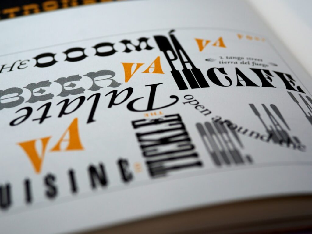
Choosing the Right Font
Selecting the appropriate font is a foundational step in establishing effective typography. The choice of typeface can significantly influence the tone and personality of a website. For example, serif fonts like Times New Roman convey a sense of tradition and reliability, making them suitable for formal content such as news articles or academic papers.
In contrast, sans-serif fonts like Arial or Helvetica offer a modern and clean aesthetic, often preferred for digital interfaces due to their legibility on screens. When choosing a font, designers should also consider the context in which it will be used. A playful script font may work well for a children’s website but could be inappropriate for a corporate brand.
Additionally, the font’s versatility across different weights and styles can enhance its usability. A typeface that offers various options—such as bold, italic, and light—allows designers to create visual interest and establish a hierarchy without needing to introduce multiple fonts, which can lead to a cluttered design.
Establishing a Hierarchy

Establishing a typographic hierarchy is essential for guiding users through content effectively. Hierarchy helps readers navigate information by indicating the importance of different text elements through size, weight, and style variations. For instance, headings should be more prominent than body text to signal their significance.
A well-defined hierarchy not only improves readability but also enhances the overall user experience by making it easier for visitors to scan content quickly. To create an effective hierarchy, designers can employ various techniques. Utilizing larger font sizes for headings and subheadings while maintaining smaller sizes for body text is a common practice.
Additionally, contrasting weights—such as using bold for headings and regular for body text—can further emphasize important information. Color can also play a role in establishing hierarchy; for example, using a distinct color for headings can draw attention and differentiate them from surrounding text. By thoughtfully arranging these elements, designers can create a clear visual path that guides users through the content.
Setting Font Sizes Responsively
| Device Width | Font Size |
|---|---|
| 320px | 16px |
| 480px | 18px |
| 768px | 20px |
| 1024px | 22px |
Setting font sizes responsively is a critical component of responsive typography. Fixed font sizes can lead to poor readability on smaller screens, where text may appear too small or require excessive zooming. To address this issue, designers often use relative units such as ems or rems instead of pixels.
These units allow font sizes to scale proportionally based on the user’s settings or the parent element’s size, ensuring that text remains legible across devices. Another effective approach is to implement a fluid typography system that adjusts font sizes based on the viewport width. This technique involves using CSS functions like `clamp()` to define minimum and maximum font sizes that adapt as the screen size changes.
For example, a designer might set a base font size that scales between 16px and 24px depending on the viewport width. This method not only enhances readability but also creates a more harmonious visual experience as users transition between devices.
Utilizing Fluid Typography
Fluid typography takes responsive design a step further by allowing text to scale continuously rather than in discrete steps. This approach creates a more dynamic reading experience, as font sizes adjust smoothly based on the viewport dimensions. By employing CSS techniques such as `calc()` or `clamp()`, designers can define fluid typography that responds to changes in screen size without abrupt jumps in text size.
For instance, a designer might set a base font size of 16px that grows proportionally with the viewport width using a formula like `font-size: calc(1rem + 1vw);`. This means that as the viewport expands, the font size increases gradually, maintaining readability while enhancing visual appeal. Fluid typography not only improves user experience but also aligns with modern design trends that prioritize flexibility and adaptability in web interfaces.
Using Media Queries for Typography

Media queries are an essential tool in responsive design, allowing developers to apply specific styles based on the characteristics of the device being used. When it comes to typography, media queries enable designers to adjust font sizes, weights, and styles at different breakpoints to ensure optimal readability across various screen sizes. For example, a designer might set larger font sizes for desktop users while opting for smaller sizes on mobile devices to accommodate limited screen real estate.
Implementing media queries effectively requires careful planning and testing. Designers should identify key breakpoints based on their target audience’s device usage patterns and adjust typography accordingly. For instance, at a breakpoint of 768px (common for tablets), a designer might increase line height or adjust letter spacing to enhance readability on larger screens while still maintaining legibility on smaller devices.
By leveraging media queries strategically, designers can create a tailored reading experience that adapts seamlessly to user needs.
Considering Line Length and Spacing
Line length and spacing are critical factors that influence readability and overall user experience in typography. Research suggests that optimal line length for body text should be between 50 to 75 characters per line; this range allows readers to scan text easily without losing their place. Lines that are too long can lead to fatigue, while excessively short lines may disrupt the reading flow.
In addition to line length, line spacing—or leading—plays a significant role in enhancing readability. Adequate spacing between lines helps prevent text from appearing cramped and allows readers to distinguish between individual lines more easily. A common guideline is to set line height at approximately 1.5 times the font size; this ratio provides sufficient breathing room without sacrificing density or content richness.
By carefully considering these elements, designers can create typographic layouts that facilitate comfortable reading experiences.
Ensuring Readability on Different Devices
Ensuring readability across different devices is paramount in responsive typography. With users accessing content from various platforms—ranging from smartphones to large desktop monitors—designers must prioritize legibility in their typographic choices. Factors such as contrast between text and background colors significantly impact readability; high contrast improves visibility, while low contrast can strain the eyes.
Moreover, designers should consider the context in which users will engage with their content. For instance, outdoor reading conditions may require bolder fonts or higher contrast levels compared to indoor environments with controlled lighting. Testing typography under various conditions can help identify potential issues before launch.
Additionally, incorporating accessibility standards—such as ensuring sufficient color contrast ratios—can enhance usability for individuals with visual impairments.
Testing and Adjusting Typography
Testing and adjusting typography is an ongoing process that ensures optimal performance across devices and user scenarios. After implementing initial designs, it is essential to gather feedback from real users regarding their reading experiences. Tools such as A/B testing can help determine which typographic choices resonate best with audiences by comparing different versions of text layouts.
Furthermore, analytics tools can provide insights into user behavior related to typography—such as bounce rates or time spent on pages—allowing designers to make informed adjustments based on actual usage patterns. Regularly revisiting typography choices ensures that designs remain relevant and effective as user preferences evolve over time.
Incorporating Variable Fonts
Variable fonts represent an innovative advancement in typography that allows multiple styles within a single font file. This technology enables designers to adjust weight, width, slant, and other attributes dynamically without needing separate files for each variation. The benefits of variable fonts are manifold; they reduce page load times by minimizing the number of font files required while providing greater flexibility in design.
For example, instead of using separate files for bold and regular versions of a typeface, designers can utilize a single variable font file that allows them to adjust weight seamlessly through CSS properties like `font-weight`. This capability not only streamlines design workflows but also enhances responsiveness by enabling smoother transitions between styles as screen sizes change.
Staying Updated with Typography Trends
Typography trends are continually evolving as new technologies emerge and design philosophies shift. Staying updated with these trends is essential for designers who wish to create contemporary and engaging web experiences. Current trends include the use of oversized typography for impactful headlines, minimalistic sans-serif fonts for clean aesthetics, and playful combinations of typefaces that add personality to designs.
Additionally, trends such as dark mode compatibility have gained traction as users increasingly seek customizable experiences tailored to their preferences. Designers must consider how typography interacts with these trends while ensuring accessibility remains a priority. By keeping abreast of industry developments and experimenting with new techniques, designers can create innovative typographic solutions that resonate with modern audiences while maintaining usability and functionality across diverse platforms.
When exploring the intricacies of responsive typography in web design, it’s essential to consider the broader context of branding and design principles. A related article that complements the “10 Best Practices for Responsive Typography in Web Design” is the insightful piece on Top 10 Branding Mistakes That Kill Credibility. This article delves into common pitfalls in branding that can undermine a website’s effectiveness, offering valuable lessons that can be applied to ensure typography choices align with and enhance a brand’s overall message. By understanding these branding mistakes, designers can create more cohesive and impactful web designs that resonate with their audience.
FAQs
What is responsive typography in web design?
Responsive typography in web design refers to the practice of creating text that adjusts and scales appropriately based on the screen size and resolution of the device being used to view the website. This ensures that the text is easily readable and aesthetically pleasing across various devices, such as desktops, laptops, tablets, and smartphones.
Why is responsive typography important in web design?
Responsive typography is important in web design because it ensures that text is legible and visually appealing across different devices and screen sizes. It enhances the overall user experience by making the content easy to read and navigate, regardless of the device being used.
What are some best practices for responsive typography in web design?
Some best practices for responsive typography in web design include using relative units for font sizes (such as percentages or ems), setting a comfortable line height, optimizing for legibility, considering the hierarchy of text elements, and using media queries to adjust typography based on screen size.
How can designers optimize typography for legibility in responsive web design?
Designers can optimize typography for legibility in responsive web design by choosing appropriate font sizes, line heights, and line lengths. They should also consider the contrast between text and background colors, as well as the use of white space to improve readability.
What role do media queries play in responsive typography?
Media queries are used in responsive typography to apply different styles to text based on the characteristics of the device or screen size. This allows designers to adjust font sizes, line heights, and other typographic elements to ensure optimal readability and aesthetics across various devices.
How can designers maintain a consistent typographic hierarchy in responsive web design?
Designers can maintain a consistent typographic hierarchy in responsive web design by using relative units for font sizes, establishing a clear hierarchy of headings and subheadings, and ensuring that the visual weight of text elements remains consistent across different screen sizes.
What are some common challenges in implementing responsive typography?
Some common challenges in implementing responsive typography include ensuring that text remains legible at smaller screen sizes, maintaining a consistent typographic hierarchy, and addressing issues related to line breaks and word spacing. Designers must also consider the impact of responsive typography on overall page layout and design.
How can designers test the effectiveness of responsive typography in web design?
Designers can test the effectiveness of responsive typography in web design by using responsive design testing tools and simulators to view how text appears across different devices and screen sizes. They can also conduct user testing to gather feedback on the readability and usability of the typography.